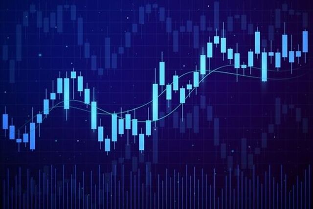
The study and mapping of trends and price patterns using numerous technical indicators, or studies, is known as technical analysis. This price-time connection can assist traders not only observe and analyzing more data but also detect periods of hesitation or emotional reversal.
To construct a strategy or technique, technical analysis is employed to assist identify the probability of entry and exit.
What are Bars and Candlesticks?
A chart is a depiction of historical prices in graphical form. Bar charts and candlestick charts are the most prevalent chart types. Although these two chart formats appear to be completely different, the information they represent is surprisingly comparable.
Different periods are used for bar and candlestick charts. For a certain period, each bar or candlestick represents the high, low, open, and closing price. Each bar/candle on a daily chart represents a single day of trade activity and each bar/candle on a 15min chart indicates 15 minutes soon, of trading activity.
Candlesticks
A candlestick is a visual representation of information regarding the price movement of an item. Candlestick charts are one of the most popular types of technical analysis because they allow traders to quickly evaluate price data using only a few price bars.
Individual candlesticks build patterns over time, which traders may use to identify key support and resistance levels. Several candlestick patterns signal a market opportunity; some reveal the balance between buying and selling forces, while others reveal continuation patterns or market hesitation.
Bars
A bar chart is a series of price bars, each representing price change over a certain period. A vertical line runs across each bar, indicating the greatest and lowest price obtained during the time. A little horizontal line on the left of the vertical line indicates the initial price, and a small horizontal line on the right indicates the closing price.
The bar may be tinted black or green if the closing price is higher than the open price. If the close is lower than the open, the price fell over that period, and the chart may be colored red. Traders can better notice patterns and price changes by color-coding the bars.
Pros of Candlesticks chart
Because it also illustrates the important price levels for a certain period, a candlestick chart is comparable to a bar chart. Candlesticks, unlike plain bars, have a variety of features and are colored to show which way the currency pair is trending. This makes it easier for a Forex trader to comprehend the currency pair’s price movement, resulting in better-educated trading decisions. There are numerous advantages of candlesticks chart in forex:-
- Charts that Outperform Traditional Charts
Candlestick charts highlight the price activity that took place in the market in great detail, but traditional bar charts have little relevance on their own. Pattern analysis may be used to assess the possibility of future movement by looking at the price motion of a Forex pair over time. Candlestick chart pattern analysis may play an important role in a Forex trader’s day-to-day life with only a little practice and timing.
- Psychological Perspective
Technical analysis is required to comprehend these psychological elements. As a result, including candlesticks pattern analysis into your technical analysis will help you discern changes in the market’s value determination without being influenced by any previously identified human flaws. Investor sentiment is another name for this. This is accomplished via candlestick charts, which depict the interplay between buyers and sellers, which is typically reflected in price movement.
- Simple to Follow
Candlestick patterns are a visual representation of a simple and precise collection of patterns. You can quickly notice emerging patterns in the market by combining candlestick charts with some basic technical analysis. You may also start profiting from these patterns when trading.
Pros of Bar charts
Bar charts are made up of many price bars, each of which depicts how the price of an asset or security changed over time. Each bar usually displays the open, high, low, and closing (OHLC) prices, however, this may be changed to display simply the high, low, and close prices (HLC). There are numerous advantages of bar charts in Forex:-
1) Simple to use
When creating trendlines and zones on the chart, the bar chart may give you a little more precision. Because bar charts are really simple lines.
2) Useful for traders
Because a bar chart shows the open, high, low, and closing prices for each session, traders and investors may get a lot of information from it.
3) determined trading ranges
It calculates the data’s high, low, open, and close values. The Open is differentiated by green color when it is above the day’s close and red color when it is below the day’s close. The bar chart, which shows the high and low points, aids in determining trading ranges.
A bar chart is made up of a vertical line and tiny horizontal lines on the left and right that indicate the open and close. A vertical line shows the period’s high and low, but the difference between the open and close is depicted by a thicker part called a true body. If the close is below the open, the body is shaded in or colored red; if the close is above the open, the body is shaded in or colored white or green. While the data is the same, the visual appearance of the two chart styles differs.
If you want to learn more about the Candlestick and Bar chart then you can enroll in the Capital Varsity Forex trading course where you will learn everything about the Forex charts in-depth.

